Model – Mia Vixen, Hollywood Glamour and Film Noir
July 16, 2010 by Darkman
Filed under All Articles, Featured, Film Noir, Film Noir Lighting, Film Noir Photography, Hollywood Glamour Lighting, Hollywood Glamour Photography, Lighting Diagrams, Videos and Tips, Models
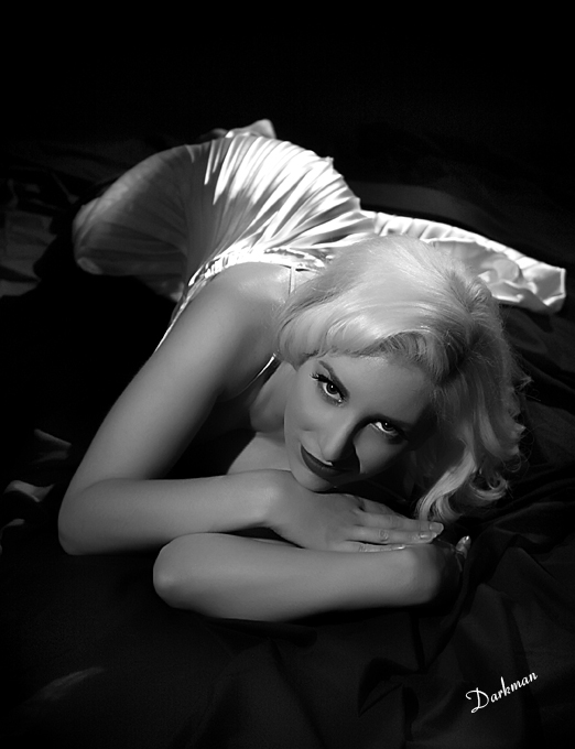
Mia Vixen is a Southern California Model and Burlesque Dancer I had the pleasure of photographing a little while ago. This first shot Old Hollywood Glamour and reminiscent of Marilyn Monroe, with the second shot being more along the lines of Film Noir. Each shot was lit with Fresnel Studio Lamps, and each had a different number of lights used.
Can you tell how many lights were used? I’ll give you a hint: Look at the High Lights and the Shadows. That’s how I reverse engineer photos I like. Look at the shadows and the direction of the lights as well as with the high lights, there you will be able to tell where the light is coming from.
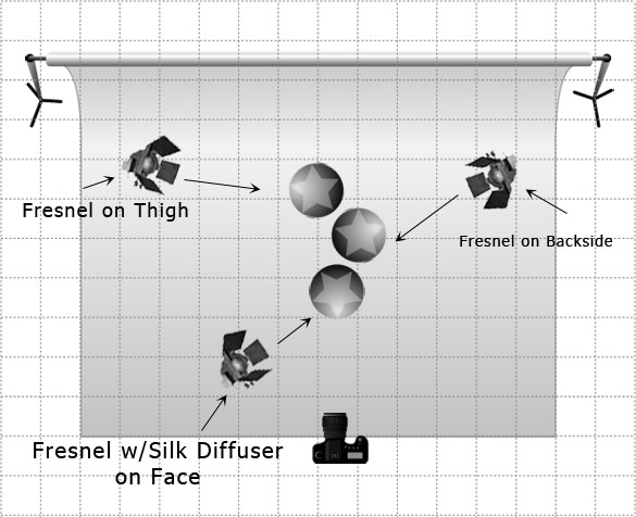
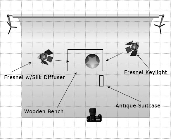
This is your typical Old Hollywood Glamour Style Photograph with a touch of Boudoir mixed in. The Lighting Diagram is below.
If you guessed 3 lights you would have been right. One on her backside, one on her thigh and one on her face. The one on her face had a silk diffuser on it to soften the center but still give a hard-ish edge to the shadow on her cheek from her nose.
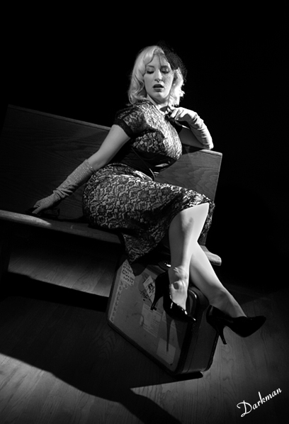
This next image could tell a story. A fine young lady is stranded at a bus stop late at night waiting for her bus. A single street light shines down on her. Her suitcase with all her worldly belongings props her legs up, in a recline. What’s a girl to do?
This would be a typical Film Noir type shot. How many lights?
If you guessed 2 you would be right. On shining down on her like a single street light would, and a second one to camera left to open up the shadows a bit to keep her from disappearing int he shadows altogether. Hollywood Glamour Photography is often mixed up as or with Film Noir but there are some heavy distinctions, which I will go into at a later post. For now, enjoy the process.
How was this post? Good? Bad? Or?
Please leave a comment below!
Check out the list of recommended
Hollywood Glamour Photography
Books and Videos Here





Mia is amazing!
Your work is great, it is a great learning resource.
Very cool that you include the lighting diagrams in some of your shots.
Fresnel lenses aren’t used as much as they used to. It’s a shame they produce a very nice effect. A lot of contrast bust still nice and smooth with a little diffusion.
From the photos I’ve seen, you really capture the that old style b&w glamouur lighting well.
I just started a new photo rating site, would you be interested in posting some photos to it?
Darkman,
Please elborate on the silks used on the fresnel? what type of silk is it and where can we get some?
Thanks,
vu
Great! I can hardly wait to try Fresnel lighting now that I’ve found a place that hires them out.
Imitation is the highest form of flattery & recognition. I’m striving to reach your level. You and your models got it nailed, keep up the good work. Merry Christmas & Happy Holidays to all. Doc
Hi and a Happy New Year, Great shots and advice as usual. I am in the process of assemblig the a set from A Touch of Evil, it’s the fist sight of Tanya (Marlele Deitrich) and would welcome your advice on the lighting.
Cheers Terry
Great inspiration and instruction. Thanks
John
I love your work Darkman but the shadow under Mia’s nose in the Hollywood Glamour shot looks too hard and unnatural to me. I’m not sure about her mouth either, although maybe that is to do with the angle of the shot? It might even be to do with the quality of the post, but either way, I find it distracting.
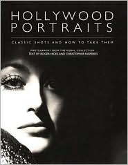
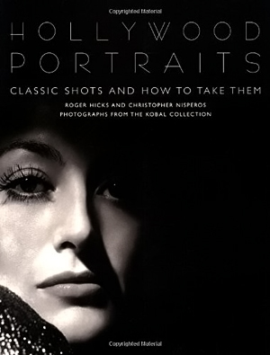
Thanks for the comment Mike. I’m sure you are not comfortable with it as many people weren’t in the old days of Hurrells lack of “Rules” when he shot. if you look above that phto as the cover of the Hollywood portraits book, you might notice the same thing going on.
I supposed the shadow could have been re-arranged with lighting but I felt the shot was fine. But thanks for the comments!